
Look beyond colour
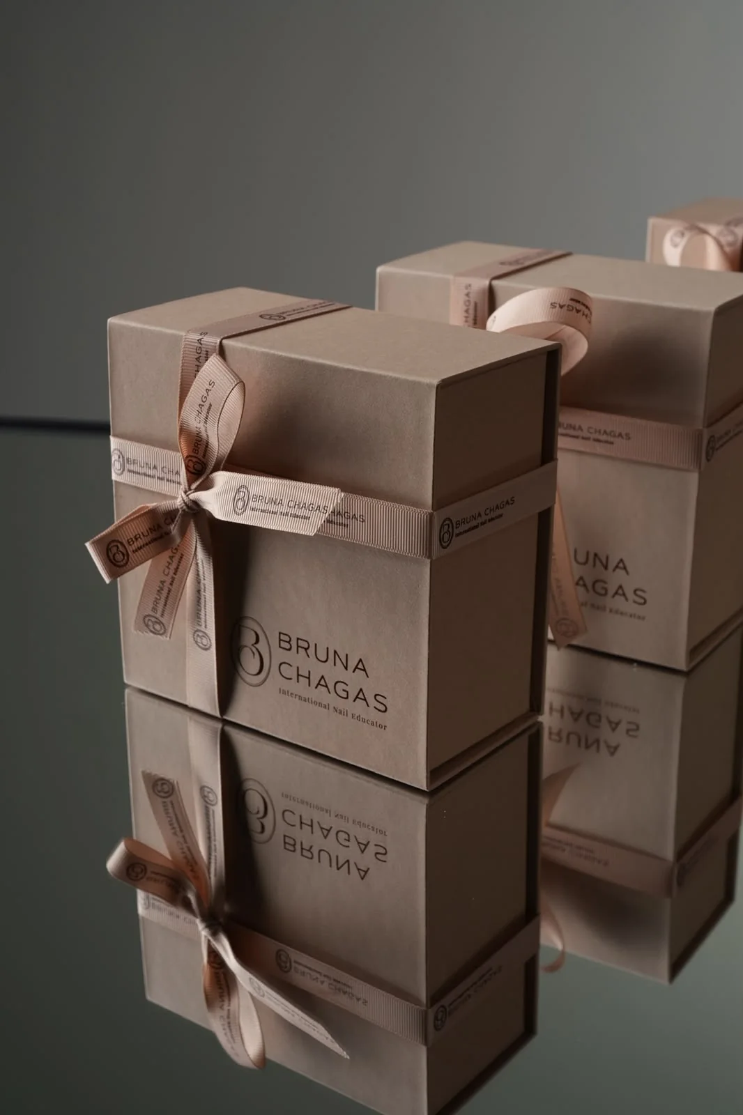
Smooth, embossed and textured papers can feel different even in the same shade. Lighting and screens change the colour you see: an image helps you explore, while a physical sample helps you decide.
Consider printing early
Logos, small text and large printed areas behave differently on different papers. Choose the material and printing process together before finalising the artwork, especially when using a textured surface.
Keep the comparison focused
Compare a few samples next to the product. Look at them under the lighting in which the packaging will be presented and handle them. A simple, consistent choice can show off the contents better than a mix of many finishes.